pizza pizza rebrand

The Pizza Pizza rebranding evolves the company’s identity and aesthetics to fit a contemporary audience, while also maintaining the iconic, recognizable feel of the original brand.
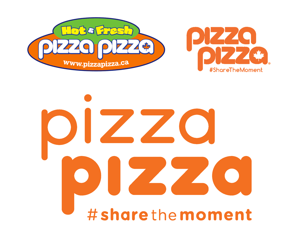
Pizza Pizza is one of the cultural icons of Ontario, as well as Canadian history. The iconic logo is familiar to every Ontario citizen and has been a part of the Ontario food culture for more than 50 years.
The objective for the redesign of Pizza Pizza is to evolve the company’s aesthetics to fit a contemporary audience, while maintaining the iconic feel of the original brand.
The colours are flattened and the visuals are simplified to make the design versatile for various devices and products that appeal to the mainstream young audience.
This evolution will allow Pizza Pizza to break away from the old-fashioned and cheap restaurant into a fresh and casual hub for social gatherings.
specifications
This specification diagram shows the full Pizza Pizza logo if it were to be used with a background fill or outline around it.
The measurement values are only if the entire width is 1000 units. Smaller or larger size values must be proportionate.
There should always be enough space for the thin-weight ‘A’ to fit all around the logo minimum, even if the background will not be used.
The rounded rectangle applies if the logo is going to be used with a background fill colour or outline only.
colours & typography


proper usage
improper usage
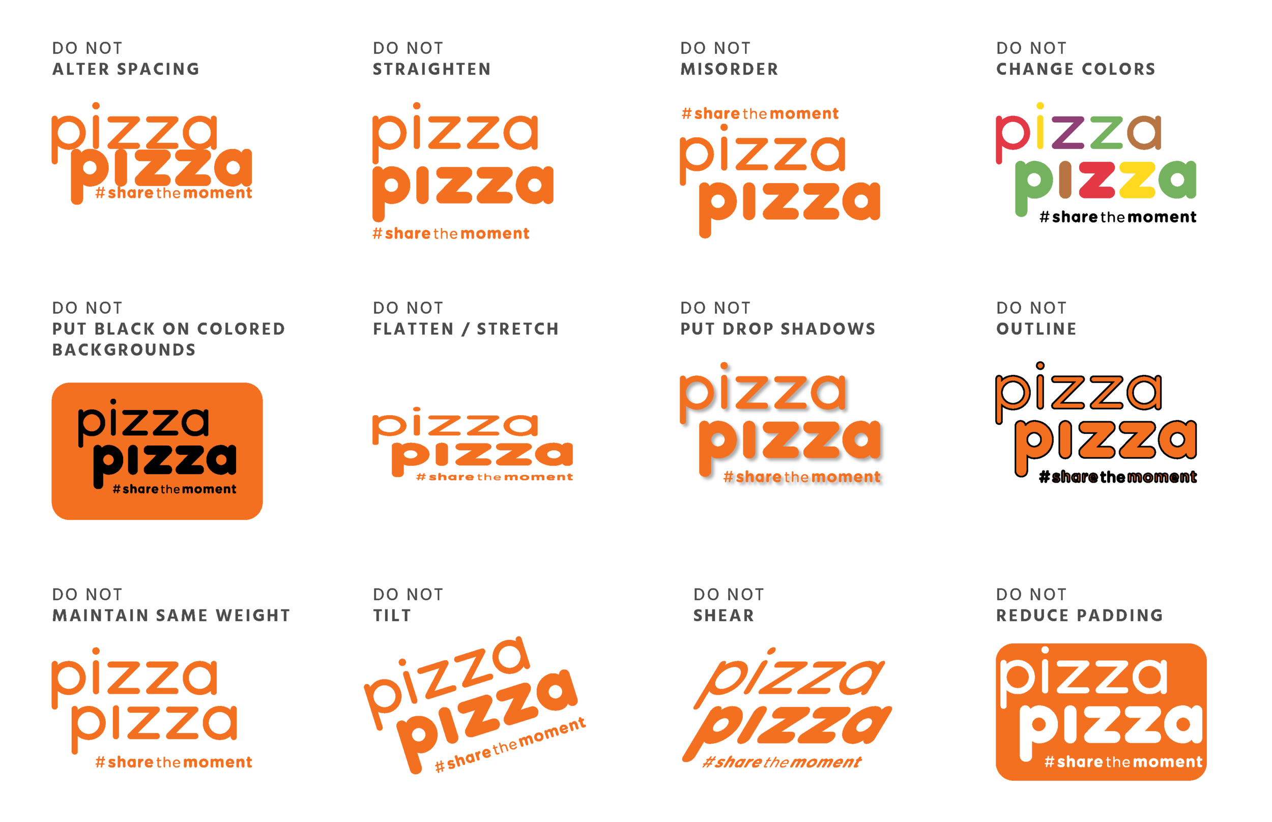
illustration treatment
packaging
The main product box / packaging is based on Pizza Pizza’s previous design, which consisted of traditional illustrations of the ingredients with a warm colour palette.
This redesign features a vibrant and fresh take on the previous colour palette and overall look. Its eye-catching and simple illustrations allows the design to be reproduced in various sizes, as well as various other applications.

mobile application

1. Seeing that the mobile application is the easiest and fastest solution for ordering pizza, the redesign includes a unified brand identity that runs throughout the app interface.
2. The app always accentuates the “Share” feature which would allow for a wide spread of social media attention, connecting to more young individuals and groups to #ShareTheMoment.
3. The humorous blurbs and icons make the process of ordering a pizza enjoyable and pleasant. The progress bar adds to the trust developed by the customer to the brand.
4. Emphasizing the Login aspect of the app makes the process of ordering and creating a pizza personal. Features in the main navigation give the user a familiarity in the process.
supplementary products
The versatility of the new brand and illustrations allows for unconventional merchandise for a pizza chain, which can make Pizza Pizza stand out as more than a simple pizza chain.
Much like how the original brand became so engraved in Ontario’s identity, the colours and illustrations used in the redesign will provide a youthful perspective on Ontario’s visual and food culture.
Both the phone cases and badges will not only give younger customers with a visual pop in their daily lives, it will also become a successful promotion for Pizza Pizza that is not so painfully obvious and forced.